After the U.S. platform shipped, the harder question arrived.
ACE is the cloud system replacing every International Private Bank platform with one. I lead design for Asset transfer and Lending, and for the design system underneath all of it. One workflow pattern now runs Payment, Lending, Asset transfer, and Deposit. Launched 2025. 25% of IPB products migrated so far.
Measured: products live on ACE against the total International Private Bank product count, one year into a three-year migration.
The International Private Bank ran on outdated architecture: every workflow was manual and different, multiple users worked one ticket with no clear ownership, and the design system underneath met neither the product's needs nor accessibility standards.
A platform migration with four product teams, each carrying years of habits from their own legacy tools.
I researched all four products’ workflows: what was manual, where tickets got lost, and which feature upgrades the legacy platform had blocked. User interviews across advisors, client service, and operations, plus workshops where each product owner walked me through their workflow, and I mapped every workflow side by side as I went.
I took the two most complex flows and detailed them until the common pattern surfaced. If the pattern held for the hardest two, the other workflows could fit inside it.
I presented the pattern to all four product teams with one question: does this fit your product? The side-by-side workflow map made the shared stages easy to see, and team feedback drove iterations until every product could see its own workflow inside the shared one.
I validated the pattern on a Lending workflow it had never seen, then user testing with 4 users confirmed the flow. The pattern was locked as the platform standard.
The governance model scaled the pattern to every product: teams flag workflows that do not fit, I take the requirement, apply it to the shared workflow, and extend the pattern. Master design hand-off files and documentation put the pattern in front of stakeholders before requirement decisions are made, and each new requirement widens the platform instead of forking it.
QA, pilot testing, then launch. 25% of IPB products migrated, with user testing feeding the next wave.
One shared header holds the client, the case, and the risk lights. The three tabs are the three stages of the pattern. Only the content below the tabs changes.
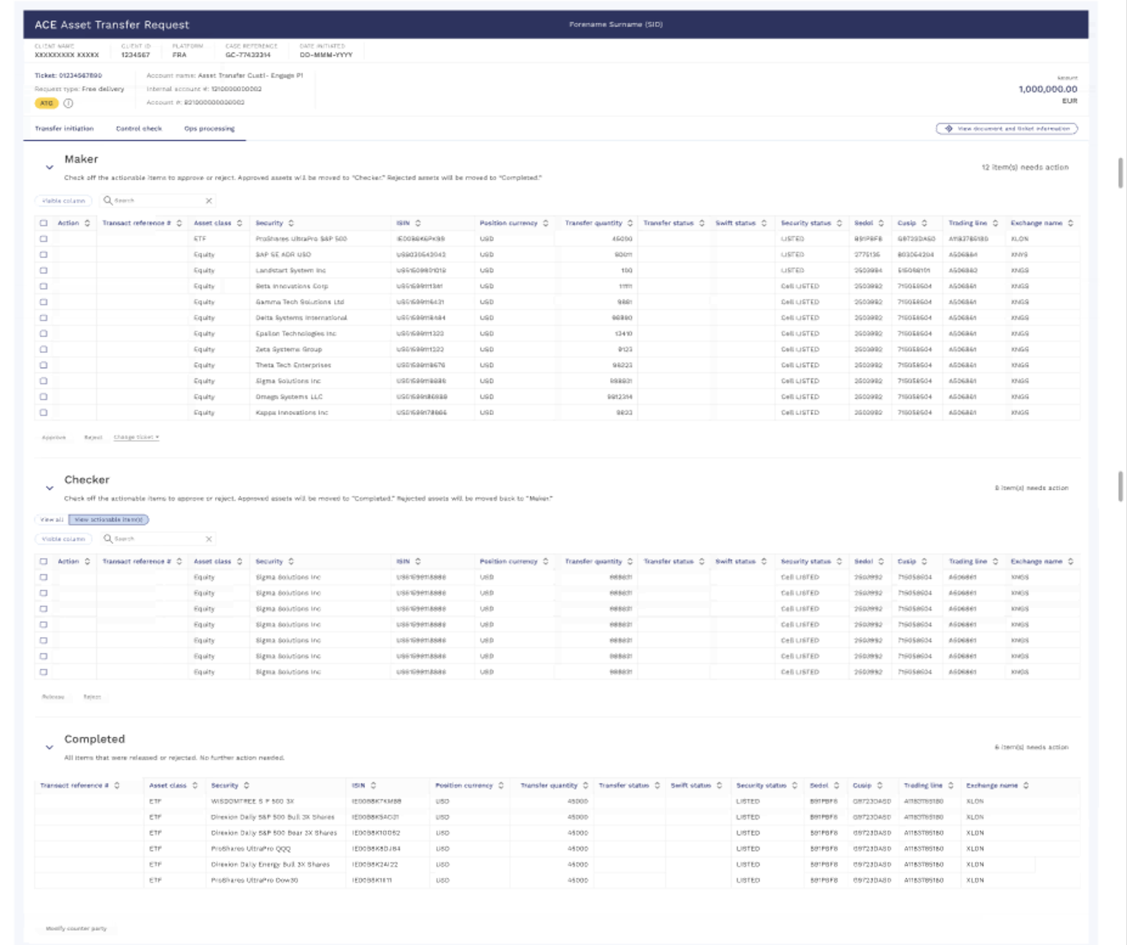
Version A. Three stages: Maker, Checker, Completed. Simple, but after submission a security's backend state is invisible. Real screen, dummy data.
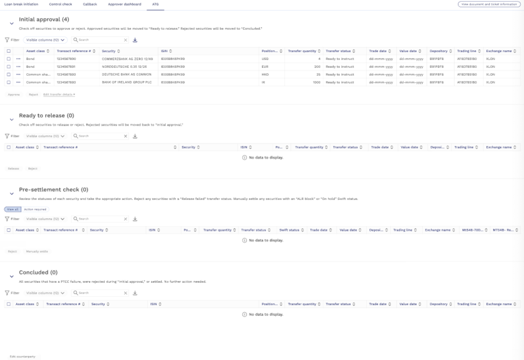
Version B, shipped. Initial approval, Ready to release, Pre-settlement check, Concluded. Each stage carries its own actions, and Swift exceptions surface as a stage. Users chose visibility. Real screen, dummy data.
Each product team wanted a custom workflow optimized for itself. That is how the legacy platforms became four different tools nobody could move between.
I proposed one pattern with small variations, and laid all four products' workflows side by side, stage by stage, on one map. Seeing the shared stages next to each other is what won the room: Initiation, Approval, Control check everywhere, and a per-product final stage where products genuinely differ. That side-by-side comparison is also what got all four products to one learnable pattern.
Consistency and easier onboarding across every product, and a pattern new products can adopt without a redesign.
This was the line I held: every product moves money or assets, so automated controls are non-negotiable everywhere. Settlement is where products truly differ, so I let only that stage vary. Flexibility earned everywhere else, none at the control gate.
One control check table for all workflows: check name, status, and when something fails or pends, the reason, the user action, and who got assigned, all in one row. Visibility across every user touching the ticket.
Missing tickets dropped to zero, tracked before and after the stage shipped. Issues get resolved together instead of lost in inboxes.
Multiple users work one ticket. When ownership lives in people's heads, coordination is manual and every handoff adds delay and risk.
Each step names who initiates, who validates, and who completes. Securities move through assign, validate, and completed tables with approve and reject at each step, so the interface itself is the coordination.
Progress is visible as structure: stage counts and tables say exactly where every security stands and whose move it is.
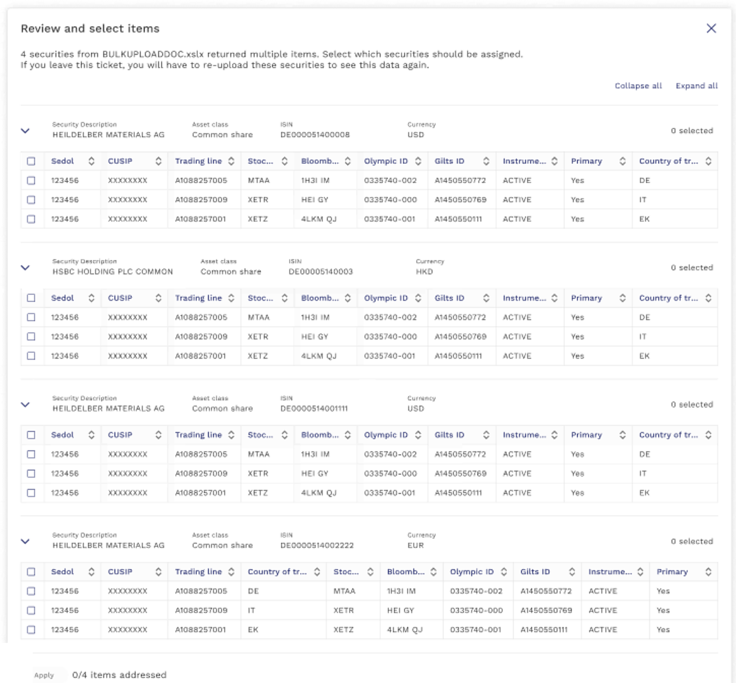
Asset transfer tickets carry 20 to 50 securities, sometimes 100+. Bulk upload reads the client’s Excel instruction sheet, but instructions describe each security in about 12 columns and the system could read only 5, so one row could match several securities. The requirement said: on a multiple match, fail the row and let the user search and pick by hand. Product called anything more a luxury feature. No time, no resources.
I saw a risk, not a luxury. Every failed row sent the user out of the app to cross-check the instruction sheet, then back in to re-search and pick, one round trip per security. Twenty securities, twenty round trips. Confusion meant mistakes, mistakes got caught mid-review, tickets bounced back to the first user, and completion time grew. That time reaches the client.
Instead of arguing, I offered evidence. I designed both flows, built the A/B test myself, put users on both, and brought the results to the product executive director to make the call.
The in-app resolution won: users caught problems early, big or small, and the design shipped. No other bulk upload had this feature. It was recognized across the Private Bank org and delivered Private Bank-wide, adopted by other bulk-upload products.
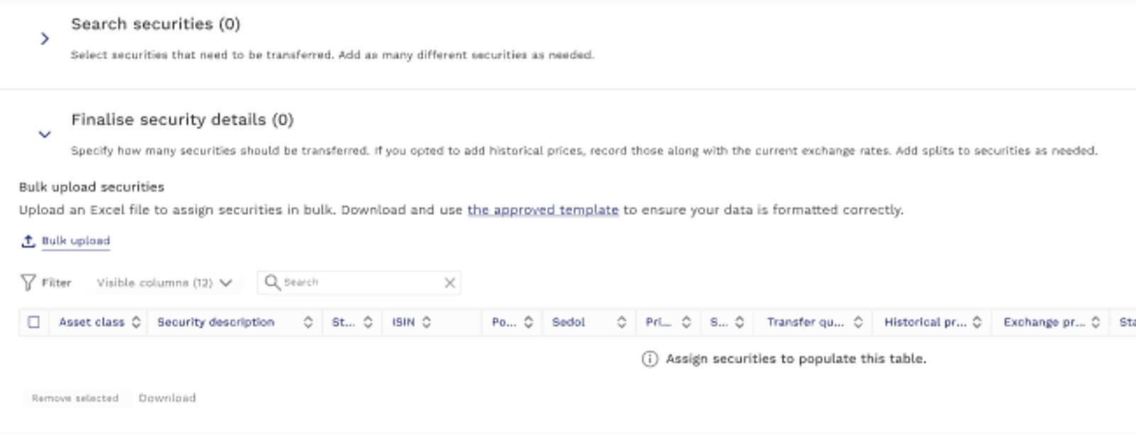
Step 1. Bulk upload lives inside Finalise security details, next to the approved template.
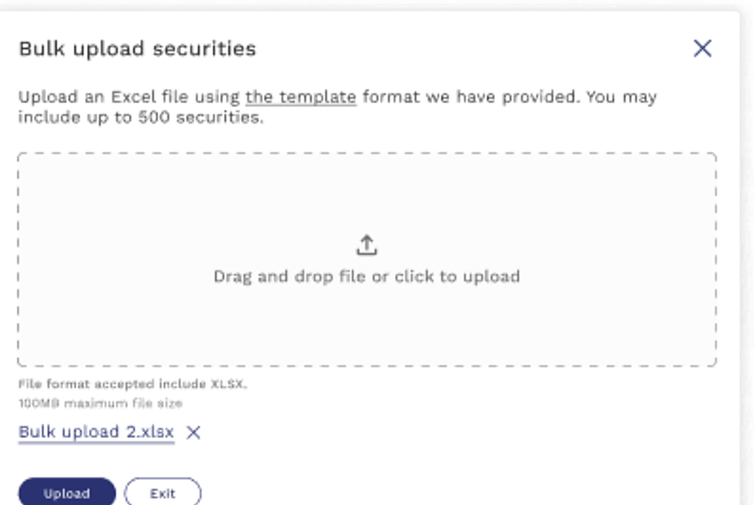
Step 2. Upload the Excel template. Up to 500 securities per file.
Step 3. Right after submit, every multiple match is resolved in-app: candidates per security, select, apply. Real screens, dummy data.
The old system met neither product needs nor accessibility standards, and a shared pattern needs shared components to stay shared.
A new design system meeting accessibility standards, supported in Storybook, plus a content glossary that levels product, engineering, and new designers on one brand voice.
The pattern survives new products and new hands because the pieces it is built from are governed.
Initiation → Approval → Control check runs every product. Only the product-specific tail (and Payment's pre-approval callback) changes.
Still in flight, honestly: the migration is at 25%, the 2027 target is real work, and the next launches will test whether the pattern holds for products we have not met yet. Geneva, Singapore, and Hong Kong are next, shipping more features in January 2028.
The Service Platform made authentication trustworthy. ACE makes an entire bank's workflows learnable and governed. SPOT OM asks what happens when the worker is an AI. The same design problem runs through all three: people trusting systems with things they cannot afford to lose.
Service Platform case study → · SPOT OM case study →
If you are modernizing systems people already depend on, that is the work I want to do.
Ask me about any decision in this platform. I can walk you through the why in twenty minutes.
Ashley Kim · ashleykim1229@gmail.com